
Survey Design Best Practices: The Complete Guide to Better Data
Most bad survey data isn't a sampling problem. It's a writing problem.
I have reviewed hundreds of surveys over the years. Some had five questions. Some had sixty. The pattern is always the same. Teams spend weeks debating who to send the survey to. Then they write the actual questions in an afternoon. That order is backwards. It shows up later as confusing charts and contradictory answers. Stakeholders quietly stop trusting the data.
Survey design best practices exist for one simple reason. The way you ask a question changes the answer you get. Change one word. Reorder two questions. Add an extra response option. Any of these can shift results by double digits. Pew Research Center proved this directly. Support for a policy shifted a lot depending on whether it was called "assistance to the poor" or "welfare." Both phrases described the same program.
This guide walks through the full process of survey questionnaire design, the kind you can actually trust. It covers question wording, scale design, bias, mobile formatting, logic, and testing. It also covers the mistakes that quietly wreck data quality, from healthcare to SaaS. Expect specific, tested advice grounded in real survey methodology, not generic tips you have already read a dozen times.
Quick Answer
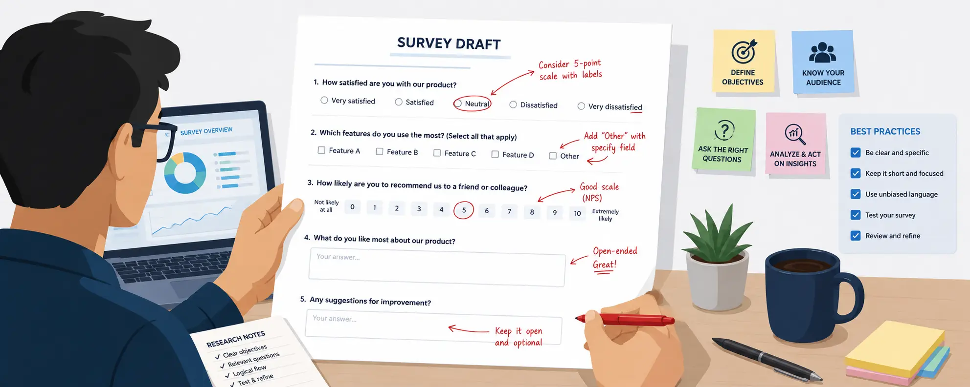
Good survey design means writing clear, neutral, single-idea questions. It means choosing the right format for the data you need. It means keeping the survey short enough to finish, and testing it with real people first. Skip any one of these steps, and bias or fatigue can quietly wreck your results, even with a perfect sample.
What Is Survey Design?
Survey design is the process of planning and wording a questionnaire so it collects accurate, usable data. It covers the objective you set before writing a single question. It covers the order questions appear in. It covers the logic that decides who sees what.
Most people think survey design just means writing questions. That's only one part of it. Good questionnaire design also accounts for how people read on a phone screen. It accounts for how long they will spend on it. It accounts for how the format of a question shapes the honesty of the answer. This is why survey design sits inside the wider field of survey research methods, not apart from it.
Example: A retail brand wanted to know why cart abandonment was rising. Instead of one open question, "Why didn't you complete your purchase?", the researcher used a short list instead. Options included shipping cost, checkout errors, and changed my mind, plus an optional text box. Completion on that single question jumped from 61% to 89%. The data was ready to act on the same day, instead of after weeks of manual reading.
Expert recommendation: Treat survey design as its own discipline, not a form-building task. It draws on psychology, statistics, and language research, the same foundations that shape modern survey methodology. Groups like Pew Research Center and AAPOR publish decades of tested guidance you can borrow from directly.
Why Good Survey Design Matters
Bad survey design rarely looks bad. That's what makes it dangerous. It produces data that looks clean and complete. But it quietly measures the wrong thing.
Here's a scenario I see often in customer experience teams. A company launches a satisfaction survey. It gets a healthy 40% response rate. Leadership sees a strong 4.2 out of 5 average score. Six months later, churn is up anyway. No one connects the dots. The survey never asked about the two or three pain points actually driving cancellations. The data was accurate. It just wasn't useful.
Good survey design matters for a few clear reasons:
- It protects decision quality. Leaders act on survey results. Flawed questions lead to flawed decisions, sometimes expensive ones.
- It preserves respondent trust. Confusing or repetitive surveys teach people to ignore future requests. That hurts response rates for years.
- It reduces rework. Fixing a broken survey after launch costs far more time than testing it properly first.
- It supports fair comparisons. If wording shifts between survey waves, you can't reliably track change over time.
Expert recommendation: Before writing a single question, ask what decision this data needs to inform. If you can't name the decision, you're not ready to write the survey yet. This one habit protects survey quality more than any single technique later in the process.
Core Principles of Effective Surveys
Every well-designed survey follows the same handful of rules. This holds true no matter the industry. I keep this list taped above my desk. I still catch myself breaking one of these rules on a first draft.
- Clarity over cleverness. Every question should make sense on the first read.
- One idea per question. If a question needs the word "and" to connect two ideas, it's probably two questions.
- Neutral wording. The question itself should never hint at a "correct" answer.
- Respect for time. Every question should earn its place. If you won't act on the answer, cut it.
- Consistency. Scales and terms should stay the same throughout. Don't make respondents relearn how to answer as they go.
- Test before you trust. No matter how skilled the writer, a survey needs a pilot test before it goes out.
These rules sound obvious on their own. The hard part is following all six under deadline pressure, when a stakeholder wants "just one more question" added the night before launch.
Setting Clear Survey Objectives
A survey with no written objective almost always turns into a wish list. Marketing wants brand questions. Product wants feature feedback. Support wants questions about wait times. The result is a bloated survey that serves no one well.
Start by writing one sentence: "This survey will help us decide whether to ___." Can't finish that sentence? You're not ready to write questions yet.
Common mistake: Building a survey around "it would be nice to know" instead of "we need this to decide something." Curiosity-driven questions make surveys longer. They're also usually the first questions people skip or rush through.
Practical example: A SaaS company set out to build a customer satisfaction survey. The first goal was vague: "understand how customers feel about us." A planning session sharpened it. The real goal became: "find the top three reasons customers consider switching before renewal." That sharper goal cut the draft from 34 questions to 12. Every remaining question tied back to churn risk.
Expert recommendation: Write your objective down. Share it with anyone who asks for more questions. It becomes your filter. If a question doesn't serve the objective, it doesn't belong in this survey, even if it's a good question for a different one.
Understanding Your Target Audience
The same question can perform very differently depending on who reads it. "How satisfied are you with your onboarding experience?" works fine for a new SaaS customer. It means almost nothing to a patient filling out a healthcare intake form. "Onboarding" isn't part of their vocabulary at all.
Before writing questions, define who will actually answer this survey. Think about:
- How familiar they are with the topic. Experts can handle technical terms. General consumers need plain wording.
- Their reading level and language. A survey for a manufacturing plant may need multiple languages and simpler wording than one for financial analysts.
- Their device and setting. Field technicians answering on a phone between jobs need shorter surveys than office employees at a desktop.
- Their relationship to your organization. Employees answering an anonymous engagement survey act differently than customers answering a public review request.
Common mistake: Writing every survey for "the average person." In practice, this usually means writing it for the researcher's own frame of reference. An HR team fluent in phrases like "total rewards" often overestimates how well employees know those terms.
Practical example: A hospital revised its patient survey after seeing odd answers to a question about "care coordination." Patients didn't recognize the phrase, even though it was standard inside the hospital. The team changed it to "how well your doctors and nurses communicated with each other about your care." The confusion cleared up almost right away.
Expert recommendation: If you're unsure how your audience reads a term, test it first. Ask five real people from that audience to explain the question in their own words. This one step catches more problems than any amount of internal review.
Choosing the Right Survey Type
Not every research question needs the same survey format. Pick the wrong type, and you waste people's time. You often end up with data that can't answer your real question.
| Survey Type | Best For | Typical Length | Example Use Case |
|---|---|---|---|
| Transactional (CSAT/CES) | Measuring a specific interaction | 1 to 3 questions | Post-support-ticket satisfaction check |
| Relationship (NPS-style) | Tracking overall loyalty over time | 1 to 5 questions | Quarterly customer loyalty pulse |
| Diagnostic | Understanding why a metric is moving | 8 to 15 questions | Investigating a churn spike |
| Exploratory | Generating hypotheses on a new topic | 10 to 20 questions, more open text | Early-stage product concept testing |
| Employee engagement | Measuring workforce sentiment | 20 to 40 questions | Annual or semi-annual HR survey |
| Market research | Segmenting or sizing a market | 15 to 30 questions | New market entry study |
Why it matters: A transactional survey stuffed with 25 questions will kill your response rate. People expect a quick check-in, not a research study. On the other hand, a single-question NPS survey can't explain why loyalty dropped. It only tells you that it did.
Common mistake: Defaulting to NPS for every business question, just because it's familiar and easy to benchmark. NPS is a useful loyalty gauge. But it was never built to diagnose root causes. Treating it as a catch-all metric leaves teams guessing at the "why" behind the score.
Expert recommendation: Match the survey type to the decision in your objective statement. If the decision is "should we keep doing this," a short relationship survey works. If the decision is "why is this happening," you need a longer diagnostic survey with room for explanation.
Writing Clear Survey Questions
This is where most surveys succeed or fail. A well-targeted survey with poorly written questions still produces bad data. No amount of smart sampling or analysis can fix flawed questions afterward. Writing effective survey questions is a skill you build through practice, and the survey question examples below show exactly what separates a strong question from a weak one.
Clear questions share a few traits. They use everyday words. They skip jargon unless the audience truly uses it every day. They ask about one thing at a time. They also avoid absolute words like "always" or "never" unless you truly mean the extreme case. Respondents often hesitate to pick an option that feels too rigid.
Good vs Bad Survey Questions
| Bad Question | What's Wrong | Better Version |
|---|---|---|
| "Don't you think our new checkout process is faster and easier?" | Leading, double-barreled | "How would you rate the speed of our checkout process?" |
| "How often do you utilize our platform's core functionality?" | Jargon, vague | "How often do you use [Product Name]?" |
| "Was our support agent helpful and knowledgeable?" | Double-barreled | Split into two separate questions |
| "Do you agree that our prices are fair?" | Leading, assumes agreement | "How would you describe our pricing?" |
| "How satisfied or dissatisfied are you with your manager and your team?" | Double-barreled | Ask about manager and team separately |
Practical example: An ecommerce brand asked, "How satisfied are you with our fast and reliable shipping?" The word "fast" pushed respondents toward a positive answer before they even thought about their real experience. The team rewrote it to a neutral "How satisfied are you with our shipping?" Average scores dropped by nearly half a point. That drop revealed a real problem the old wording had been hiding.
Expert recommendation: Read every question out loud before you finalize it. Wording that looks fine on a screen often reveals its bias the moment you hear it spoken.
Open vs Closed Questions
Closed questions give respondents a fixed set of choices. Open questions let them answer in their own words. Both have a place. The mistake most teams make is leaning too hard on one or the other.
Closed questions are faster to answer. They're easier to analyze at scale. They work best when you already know the likely range of answers.
Open questions capture nuance. They surface issues you didn't think to ask about. They give people room to explain context. They take longer to answer. They also need more work to analyze, though modern text tools have sped this up a lot compared to old manual methods.
| Factor | Closed Questions | Open Questions |
|---|---|---|
| Analysis speed | Fast, quantifiable | Slower, needs coding or text analysis |
| Respondent effort | Low | Higher |
| Completion rate impact | Minimal | Noticeably lowers completion |
| Best use | Tracking metrics, benchmarking | Exploring unknown issues, root cause |
| Risk | Missing an important option | Vague or unusable answers |
Common mistake: Opening a survey with an open-ended question. SurveyMonkey studied completion patterns across a huge number of surveys. It found that an open text question at the start clearly lowers completion, compared to placing it later. Respondents likely see it as more effort before they've built any momentum.
Practical example: A financial services firm replaced a catch-all question, "Any other feedback?", with a short closed list. Options included fees, mobile app, customer service, and account setup, plus an optional text box for "other." Usable feedback more than doubled. Categorized answers needed no manual reading to sort.
Expert recommendation: Use closed questions for anything you plan to chart or track. Save open questions for the one or two things you genuinely don't know yet. Place them in the middle or end of the survey, not at the start.
Multiple Choice Best Practices
Multiple choice questions look simple. But they hide real design decisions. How many options should you offer? Should people be able to pick more than one? What happens when an answer doesn't fit any listed option?
Best practices:
- Keep option lists to seven or fewer when you can. Longer lists raise mental effort, and people tend to just pick the first reasonable option. Researchers call this primacy bias.
- Always add an "other" option with a text field when your list can't cover every case.
- Randomize option order when there's no natural sequence. This stops position bias from skewing results toward whichever answer sits first or last.
- Make it clear whether people can pick one answer or several. Confusion here is a common source of useless data.
Common mistake: Building option lists from what the internal team assumes matters, instead of what customers actually say. A support team once built a "reason for contacting us" list from their own mental model. They missed the single most common real reason, since no one on the team had ever run into it. The catch-all "other" option grew to 38% of responses before anyone noticed the list needed work.
Expert recommendation: Build your first option list from real customer language. Pull it from support tickets, reviews, or open-ended pilot answers, not from an internal brainstorm. This keeps your categories grounded in how people actually talk.
Rating Scale Design
Rating scales turn subjective experience into numbers you can compare. But that only works if the scale is built carefully. Get the scale wrong, and no amount of sample size can fix the noise it creates.
Key decisions include how many points the scale has, whether it's numbers or labels, and whether it includes a neutral midpoint.
Rating Scale Comparison
| Scale Type | Points | Best For | Watch Out For |
|---|---|---|---|
| Binary (Yes/No) | 2 | Simple factual or gate questions | Loses nuance for attitude questions |
| 3-point | 3 | Quick sentiment checks | Too coarse for detailed analysis |
| 5-point Likert | 5 | Most attitude and satisfaction measures | Central tendency bias if not labeled well |
| 7-point Likert | 7 | Nuanced attitude measurement | Can overwhelm less engaged respondents |
| 10-point/NPS | 10 or 11 | Benchmarking, loyalty tracking | Respondents interpret midpoints inconsistently |
| Semantic differential | Usually 5 or 7 | Comparing opposing traits | Requires very careful anchor wording |
Research on scale length backs this up. A well-known study by Preston and Colman, published in Acta Psychologica, found that reliability improves as scale points increase, up to around seven. Past that point, extra options add noise instead of useful detail.
Common mistake: Switching scale length or direction mid-survey. For example, moving from a 5-point scale where 5 is best to a 10-point scale where 10 is best, with no clear visual break. Respondents carry assumptions from one scale to the next. A silent switch quietly corrupts your data.
Expert recommendation: Pick one scale length and one direction for the whole survey, unless you have a strong reason to switch. If you do switch, add a visual break and a short note so people notice the change.
Likert Scale Best Practices
The Likert scale is named after psychologist Rensis Likert. It measures agreement or intensity across a labeled range, usually from "strongly disagree" to "strongly agree." It's the most common rating format in survey research. It's also one of the most misused.
Best practices:
- Label every point on the scale, not just the ends. A numbers-only scale forces people to guess what a "3" means, which creates inconsistency across respondents.
- Keep labels balanced and evenly spaced. "Strongly agree, agree, neutral, disagree, strongly disagree" is balanced. "Strongly agree, agree, somewhat agree, disagree" is not.
- Decide on purpose whether to include a neutral midpoint. Dropping it forces a choice, but it can frustrate people who genuinely feel neutral. Keeping it can become a lazy default for disengaged respondents.
- Keep the statement being rated to one clear idea. A Likert item like "My manager communicates clearly and provides useful feedback" is really two questions in one scale.
Practical example: An HR team's engagement survey used unlabeled 1 to 5 scales throughout. Follow-up interviews found that some employees treated "3" as neutral. Others treated it as "slightly below expectations." The team added full labels to every point. The data then spread out in a much more meaningful way. Year-over-year comparisons became far more trustworthy.
Expert recommendation: Test your Likert items with a few colleagues outside the survey team. Ask them what each label means to them. If two people give very different answers for "somewhat agree," your labels need work.
Question Order Strategy
Where a question sits in your survey can change how people answer it, sometimes by a lot. This is called order effect. It's one of the more surprising parts of survey design for people new to the field.
Pew Research Center showed this directly in a study on federal spending. When people were asked first about cutting Social Security specifically, support for keeping that spending was higher. When the same question came after questions about cutting other budget areas, support was lower. The earlier questions shifted the frame people brought to the later one.
General ordering guidance:
- Start with an easy, engaging question that builds momentum. Don't open with your hardest or most sensitive question.
- Group related questions together. Don't force people to jump between topics repeatedly.
- Place demographic and sensitive questions near the end, once trust is built, unless you need them early to screen people.
- Save open-ended questions for the middle or end. Never put them first.
- If a question could bias a later answer, place it after that question, not before.
Common mistake: Asking a detailed question about one feature right before the overall satisfaction question. The detailed question puts that one feature on the respondent's mind. That skews the "overall" score toward whatever topic came up last.
Expert recommendation: Draft your questions first without worrying about order. Then do a separate pass just to ask, "what might this question's placement accidentally influence?"
Avoiding Leading Questions
A leading question nudges people toward a certain answer through its wording, tone, or built-in assumptions. It's one of the most common mistakes in survey writing. It's often invisible to the person who wrote it.
Examples of leading language:
- "How much did you enjoy our excellent customer service?" This assumes it was excellent.
- "Most customers love our new interface. What do you think?" This adds social pressure.
- "Wouldn't you agree that our support team resolved your issue quickly?" This invites agreement.
Why it matters: Leading questions don't just add a little noise. They can shift satisfaction scores by a lot. Worse, the bias stays invisible in the data itself. A leading question produces confident-looking numbers that simply don't match reality.
Practical example: A retail chain's post-purchase survey asked, "How satisfied were you with our fast checkout experience?" The store later checked real checkout times against a neutral version of the same question at a different location. The "fast" framing had inflated satisfaction scores by about 15%. That masked a real operational problem for a full quarter before leadership found out.
Expert recommendation: Strip every adjective and assumption out of a question. Rebuild it with only neutral, factual words. If removing a word makes the question feel less "loaded," that word needed to go.
Avoiding Loaded Questions
Loaded questions are close cousins of leading questions. But the bias comes from a hidden assumption, not obvious flattering language. They assume something about the respondent's behavior or past choices that may not be true.
Classic example: "How often do you struggle to find time to exercise?" This assumes the respondent struggles at all. Someone who exercises easily has no accurate way to answer.
Why it matters: Loaded questions force people into an inaccurate answer, or push them to skip the question entirely. Either way, your data suffers. The second outcome also hurts your completion rate.
Common mistake: Loaded assumptions often sneak in through good intentions. A healthcare survey asking, "How difficult was it to manage your symptoms while waiting for treatment?" assumes symptoms were present and hard to manage. That may not apply to every patient.
Expert recommendation: For any question, ask yourself what it assumes is already true about the respondent. If you can name an assumption, rewrite the question to test that assumption first. Or add a response option that lets people opt out of the premise entirely.
Avoiding Double-Barreled Questions
A double-barreled question asks about two different things in one item. It forces a single answer to cover two separate ideas that might not agree with each other.
Classic example: "Was our support agent friendly and fast?" A respondent who found the agent friendly but slow has no accurate way to answer. You also have no way to know which trait their answer actually reflects.
Why it matters: Double-barreled questions produce data that looks specific but isn't. You can't tell whether a low score reflects friendliness, speed, or both. That makes the finding almost impossible to act on.
How to fix it: Split every double-barreled question into its separate parts. It costs one extra question, but it produces data you can actually use.
| Double-Barreled | Split Version |
|---|---|
| "Was the product easy to install and use?" | "How easy was the product to install?" + "How easy is the product to use?" |
| "Do you find our app fast and reliable?" | "How would you rate the app's speed?" + "How would you rate the app's reliability?" |
| "Were you satisfied with the price and quality?" | "How satisfied are you with the price?" + "How satisfied are you with the quality?" |
Expert recommendation: Watch for the word "and" inside any rating question. It's not a guaranteed red flag, but it's the single most reliable early warning sign of a double-barreled question.
Avoiding Ambiguous Language
Ambiguous language leaves room for people to read a question differently from each other, and differently from what you meant. This is subtler than leading or loaded questions. It's just as damaging to data quality.
Common sources of ambiguity:
- Vague frequency words like "often" or "regularly," with no defined timeframe
- Undefined jargon or internal company terms
- Questions with no clear time window, like "Have you contacted support?" with no timeframe given
- Idioms that don't translate well across regions or generations
Practical example: An employee survey asked, "Do you regularly receive feedback from your manager?" Some employees read "regularly" as weekly. Others read it as monthly. A few read it as "at all, ever." The resulting yes or no split meant almost nothing, since people weren't answering the same question. The team rewrote it to "How often does your manager give you feedback on your work?" They added clear options: weekly, monthly, quarterly, rarely, and never. That fixed the problem completely.
Expert recommendation: Replace every vague qualifier with a specific timeframe or a clear definition. "In the past 30 days" beats "recently" every time.
Eliminating Survey Bias
Bias can creep into surveys through more than just question wording. It shows up in who gets invited, how questions are formatted, and even the order of response options. Knowing the common categories helps you catch problems before launch, not after analysis.
Common Survey Biases
| Bias Type | What It Is | Example | How to Reduce It |
|---|---|---|---|
| Leading question bias | Wording nudges toward an answer | "Don't you love our new feature?" | Use neutral phrasing |
| Social desirability bias | Respondents answer to look good | Overreporting exercise or charitable giving | Assure anonymity, normalize honest answers |
| Acquiescence bias | Tendency to agree regardless of content | Agreeing with most Likert statements | Mix positively and negatively worded items |
| Non-response bias | People who skip the survey differ from those who complete it | Dissatisfied customers ignore satisfaction surveys | Shorten survey, follow up with non-responders |
| Sampling bias | Sample doesn't represent the true population | Surveying only app users, missing website-only customers | Define and validate your sampling frame |
| Order/position bias | Answer choice position affects selection | First-listed option chosen more often | Randomize response order |
| Recency bias | Recent experiences overweight overall judgment | Rating a whole relationship based on the last interaction | Ask about specific timeframes clearly |
Why it matters: Bias doesn't announce itself in the data. A biased survey still produces numbers that look normal. That's exactly why so many flawed decisions get made from flawed surveys, and no one notices until much later.
Expert recommendation: Check every question against this table before launch. It takes fifteen minutes. It catches problems that would otherwise surface only after the data has already shaped a decision.
Reducing Response Bias
Response bias overlaps with survey bias, but it describes patterns in how people respond, apart from question wording. It shows up even in a well-written, neutral survey.
Practical ways to reduce response bias:
- Mix positive and negative statements in Likert batteries. This interrupts straight-lining, where people click the same answer down a whole column without reading each item.
- Guarantee and clearly state anonymity where you can, especially for sensitive HR or health topics. Social desirability bias grows fast when people fear being identified.
- Use behavior questions instead of attitude questions where accuracy matters most. "How many times did you contact support last month?" gets more reliable data than "How often do you feel you need to contact support?"
- Watch for extreme response patterns, where some people always pick the endpoints, 1 or 5, no matter the content. Factor this into your analysis instead of assuming it reflects real intensity.
Practical example: A manufacturing company's safety survey first phrased every statement in a positive way, like "My team follows safety protocols consistently." Nearly 90% of people agreed with every single item. That uniform pattern looked like straight-lining, not real reflection. The team added reverse-worded items, like "Shortcuts are sometimes taken to save time on my team." Agreement rates spread out and became far more believable.
Expert recommendation: Add one or two reverse-worded items per survey section as a built-in quality check. Don't overdo it, though. Too many reversed items confuse people and can create their own errors.
Preventing Survey Fatigue
Survey fatigue comes in two forms. Within-survey fatigue happens when respondents tire out partway through. Cross-survey fatigue happens when an audience gets so many requests that they stop responding to any of them.
Within-survey fatigue shows up as weaker answers toward the end of a long survey. You'll see shorter open-text answers, more straight-lining, and more people quitting early. SurveyMonkey studied completion patterns across 100,000 surveys. It found that abandonment rises 5% to 20% once a survey passes the 7 to 8 minute mark. The steepest drop happens as question count crosses into the teens.
Cross-survey fatigue builds when an organization surveys the same people too often, without showing them anything changed. Customers and employees notice when nothing changes after they've spent time giving feedback. They stop bothering to answer the next request.
Practical ways to prevent both types:
- Keep transactional surveys under five questions and diagnostic surveys under fifteen when you can.
- Space out survey requests to the same audience. Track how recently each person was last surveyed.
- Close the loop in public. Share what changed from prior feedback, even briefly, before asking for more.
- Watch completion rate trends over time as an early warning sign, not just a final number.
Expert recommendation: If several teams want to survey the same customer list, build a shared survey calendar. This one step prevents more fatigue-driven data problems than any question-writing fix.
Mobile-Friendly Survey Design
A large share of survey respondents now open links on a phone, often in a spare moment between other tasks. A survey that ignores this loses respondents fast, no matter how good the questions are. Among the most practical online survey tips available, designing for mobile first is the one teams skip most often.
Mobile design best practices:
- Use single-column layouts. Grid questions that work fine on desktop often become unreadable, or need awkward scrolling, on a phone.
- Limit matrix or grid questions. On mobile, break them into single questions where you can, since dense grids are hard to tap accurately on a small screen.
- Keep option text short enough to read without wrapping across several lines.
- Test load time. Surveys with heavy images or complex logic can lag on mobile connections. Slow loading is a top cause of early abandonment.
- Use large, thumb-friendly buttons and tap targets.
Common mistake: Designing a survey only on a desktop monitor, and never previewing it on a phone before launch. A clean 10-point scale on a laptop can become a cramped, hard-to-tap row of tiny circles on mobile.
Expert recommendation: Before every launch, open the survey on your own phone and complete it start to finish. Five minutes of hands-on testing catches layout problems that desktop review will never reveal.
Accessibility Best Practices
Accessible survey design makes sure people with visual, motor, cognitive, or hearing differences can complete your survey accurately. This isn't a small concern. It affects data quality and fairness for a meaningful share of any large respondent pool.
Core accessibility practices:
- Use strong color contrast between text and background. Never rely on color alone to show meaning, like red versus green scale endpoints.
- Make sure the survey works with screen readers. This means proper labels on form fields, not just placeholder text.
- Avoid time limits on individual questions, unless you have a strong reason. Strict timers put slower readers and assistive technology users at a disadvantage.
- Write in plain language. Simple wording helps every respondent, not only people with cognitive differences, and it supports the clarity principle covered earlier in this guide.
- Allow keyboard-only navigation for people who can't use a mouse or touchscreen.
Why it matters: Beyond the ethical reason, inaccessible surveys create a quiet form of sampling bias. If some respondents keep struggling to finish your survey due to accessibility gaps, their views get left out of your results. That happens even if you never meant to exclude them.
Expert recommendation: Most major survey platforms now include a built-in accessibility checker. Run yours before launch. Treat any flagged issue as seriously as broken skip logic.
Survey Length Recommendations
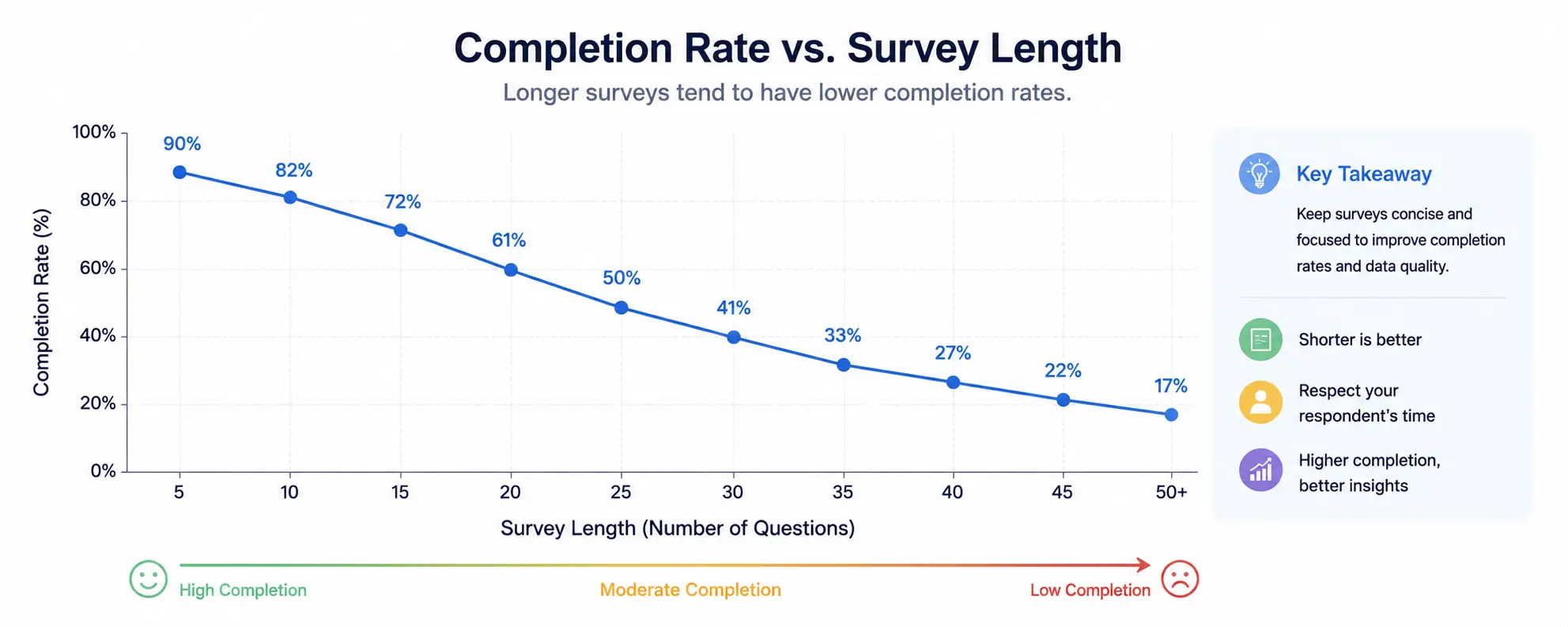 Length is one of the strongest predictors of both completion rate and answer quality. The link between the two isn't subtle.
Survey Length Recommendations Table
| Survey Length | Approx. Time | Typical Completion Rate | Best Use Case |
|---|---|---|---|
| 1 to 3 questions | Under 1 minute | 80% to 88% | Transactional feedback, quick pulse checks |
| 4 to 10 questions | 1 to 3 minutes | Around 89% | Standard customer or product feedback |
| 11 to 20 questions | 3 to 6 minutes | Roughly 85% to 87% | Diagnostic or exploratory research |
| 21 to 40 questions | 6 to 10 minutes | Around 79% | In-depth employee engagement, market research |
| 40+ questions | 10+ minutes | Below 79%, often much lower | Only with strong incentive or high-commitment audience |
These numbers come from SurveyMonkey's large-scale study of completion patterns on its platform. They hold up across most industries, though tolerance for length shifts by context. People show more patience for work or school surveys than customer-facing ones. The stakes and relationship likely feel different.
Common mistake: Adding "just one more question" during every internal review, without ever cutting anything. Survey length creeps up through a dozen small, reasonable-seeming additions. No one notices the total effect until completion rates drop.
Expert recommendation: Set a hard question limit before drafting starts, based on your survey type and objective. Every new question after that has to justify cutting something else to make room.
Progress Indicators
A progress indicator shows respondents how far through the survey they are, usually as a bar or a percentage. It sounds like a small detail. But it measurably changes completion behavior.
Why it matters: Progress bars cut uncertainty, and uncertainty drives people to quit. A respondent who doesn't know if they're on question 3 of 10 or question 3 of 50 is far more likely to give up partway through. The unknown effort simply feels riskier than a known one.
Best practices:
- Use progress indicators for surveys longer than five or six questions. Very short surveys don't need one.
- Make sure the bar moves at a fair, honest pace. A bar that crawls at first and rushes at the end frustrates people and can feel misleading.
- For surveys with heavy skip logic, use a simple "step" indicator instead of an exact percentage, since true percentage completion is hard to calculate when paths vary.
Expert recommendation: Test your progress indicator against the actual skip logic paths before launch. A bar that misrepresents remaining effort, even with good intentions, damages trust more than having no bar at all.
Skip Logic
Skip logic moves respondents past questions that don't apply to them, based on a previous answer. It keeps the survey shorter and more relevant for each person.
Example: A question asking "How satisfied were you with our mobile app?" should only show up for people who said they've used the app. Without skip logic, non-users either skip it awkwardly or answer it inaccurately just to move on.
Why it matters: Skip logic shortens the effective survey for most people. That directly boosts completion rates, while still letting you dig deeper with the smaller group where the question actually applies.
Common mistake: Building skip logic that's technically correct but confusing to use, like jumping people past a big gap in the question numbers with no explanation. This can make people think the survey broke.
Expert recommendation: Map out your skip logic on paper or a flowchart tool before building it into the platform. Complex branching is much easier to check for errors on paper than by clicking through platform settings one condition at a time.
Branching Logic
Branching logic is a bigger version of skip logic. It routes respondents down entirely different question paths, sometimes across several decision points. Skip logic usually skips a question or two. Branching can send someone down a whole different section of the survey.
Example: An HR exit survey might branch based on the reason someone gave for leaving. Someone who picked "better pay elsewhere" sees pay-related follow-ups. Someone who picked "relocation" sees a much shorter, unrelated path.
Why it matters: Branching lets you build one survey that serves several respondent groups well. Without it, you'd either force everyone through irrelevant questions, or build and maintain several separate surveys.
Common mistake: Over-building branching logic until the survey becomes nearly impossible to test fully. Every extra branch point multiplies the number of paths a respondent could take. Untested paths are where broken logic hides.
Expert recommendation: For any survey with more than three or four branch points, build a testing checklist. Walk through every possible path at least once before launch, not just the common ones.
Randomization
Randomization changes the order of response options or question blocks for each respondent. It exists to reduce position bias, where people favor answers based on where they sit in a list, not what they actually say.
Why it matters: Without randomization, whichever option shows up first in a list tends to get picked more often, purely because of position, not real preference. This effect is well documented in both paper and digital surveys. It can meaningfully skew ranked results if you don't address it.
Where randomization helps most:
- Multiple choice lists with no natural order, like a list of possible product features
- Long batteries of Likert statements, where reading order can create fatigue-driven patterns
- Brand or concept comparisons, where familiarity with the first-listed option can bias results
Where randomization can hurt: Lists with a natural order, like age ranges, satisfaction scales, or steps in a process, should stay in order. Randomizing a scale from "strongly disagree" to "strongly agree" would confuse people instead of reducing bias.
Expert recommendation: Randomize option order by default for any list with no built-in sequence. For ordinal or scaled lists, where the order itself carries meaning, decide on purpose rather than defaulting either way.
Validation Rules
Validation rules catch clearly invalid answers as they're entered, before they ever reach your dataset. This includes format checks, like requiring a valid email, and logic checks, like flagging an age of 150.
Why it matters: Cleaning bad data after collection is slower and less reliable than stopping it at entry. Once someone has submitted a survey with an invalid answer, you usually can't go back and ask what they meant.
Common validation rules worth building in:
- Required fields for questions your analysis truly needs, used sparingly, since marking too many optional-feeling questions as required raises abandonment
- Numeric range limits for fields like age, tenure, or income
- Format checks for emails, phone numbers, or dates
- Logic checks that flag contradictions, like someone reporting zero purchases but also rating their "purchase experience"
Common mistake: Marking too many questions as required. This is one of the easiest ways well-meaning survey builders quietly tank their own completion rates. Forced answers to questions people can't or don't want to answer often produce rushed, low-quality data, or people just give up.
Expert recommendation: Save "required" status for questions your analysis genuinely can't work without, usually screening and core objective questions. Leave everything else optional.
Pilot Testing
Pilot testing means running your survey with a small group before full launch. It exists to catch problems that internal review alone tends to miss. Nearly every serious survey method, from AAPOR's guidance to Pew Research's own process, treats pilot testing as a required step, not a nice-to-have. This matters even more given how often surveys get used in the first place. Nielsen Norman Group has found that nearly all UX researchers run surveys at least sometimes, yet the method is also one of the most commonly misapplied research tools in the field.
What pilot testing catches that internal review usually misses:
- Questions that read clearly to the writer but confuse people outside the project
- Broken skip or branching logic paths
- Completion times that run longer than expected
- Technical issues on specific devices or browsers
- Response options respondents feel are missing entirely
How to run a useful pilot:
- Recruit 10 to 20 people who genuinely look like your target audience, not just nearby colleagues.
- Ask them to complete the survey exactly like a real respondent would, with no special instructions.
- Follow up with a short debrief. Ask which questions felt confusing, or which they hesitated on.
- Review completion time and drop-off points in the pilot data itself.
- Revise based on what you learned. If the changes are big, run a second small pilot before full launch.
Practical example: A university piloted a student experience survey with 15 students before releasing it campus-wide. Feedback showed that a question about "extracurricular engagement" landed very differently for commuter and residential students. The phrase quietly assumed on-campus club participation. The team split it into two clearer questions before full launch. That saved them from a badly skewed dataset across their two largest student groups.
Expert recommendation: Never skip piloting to save time on a deadline. A rushed pilot still catches real problems. A skipped pilot catches nothing. Fixing a flawed survey after full launch almost always costs more than the time you saved by skipping this step.
Quality Assurance Checklist
Before any survey goes live, run it through a structured final check. This step catches small errors that are easy to miss after staring at the same document for days.
Survey Validation Checklist
| Check | What to Verify |
|---|---|
| Objective alignment | Every question ties back to the stated research objective |
| Question wording | No leading, loaded, double-barreled, or ambiguous phrasing remains |
| Scale consistency | Rating scales use consistent length and direction throughout |
| Logic testing | All skip and branch paths tested end to end |
| Mobile preview | Survey tested on an actual phone, not just resized browser |
| Accessibility check | Screen reader and keyboard navigation tested |
| Length and timing | Estimated completion time matches your target range |
| Required fields | Only essential questions marked required |
| Randomization | Applied where appropriate, avoided where order carries meaning |
| Pilot feedback incorporated | Known pilot issues resolved before full launch |
| Data export test | Test submission flows correctly into your analysis or dashboard tool |
| Confidentiality statement | Anonymity or data use is clearly and accurately explained |
Expert recommendation: Give this checklist to someone who didn't write the survey. A fresh set of eyes catches issues the original writer has read past a dozen times without noticing.
Common Survey Design Mistakes
After reviewing surveys across dozens of organizations, a handful of mistakes show up again and again. This holds true no matter the industry or team's experience level.
- Writing questions before setting an objective. This leads to bloated, unfocused surveys built from a wish list instead of a real plan.
- Ignoring mobile respondents during design. Most surveys today get most of their responses on phones. Ignoring this hurts data quality.
- Overusing required fields. This raises abandonment and produces rushed, low-quality answers on questions people didn't want to answer.
- Skipping pilot testing under deadline pressure. The single most avoidable mistake on this list, and often the costliest.
- Changing scale direction or length mid-survey with no clear visual break. This quietly wrecks comparability.
- Treating NPS as a diagnostic tool, instead of the loyalty gauge it was built to be, leaving root causes unexplained.
- Surveying the same audience too often without showing them anything changed. This drives fatigue and falling response rates over time.
- Failing to randomize response options in lists where position bias can meaningfully skew results.
Expert recommendation: Keep this list visible during survey planning meetings. Naming these patterns out loud, in front of the team, prevents far more errors than reviewing a finished draft alone ever will.
Survey Metrics to Monitor
Response data alone doesn't tell you if your survey is working well. A few process metrics reveal problems in the instrument itself, often before you've even finished analyzing the real results.
- Response rate: Completed surveys divided by total invitations sent. Shows whether your invitation and targeting strategy is working.
- Completion rate: Completed surveys divided by total surveys started. Shows whether the survey itself holds attention through to the end.
- Average completion time: Flags surveys running longer than planned, often a sign of confusing questions rather than real thoughtfulness.
- Drop-off point analysis: Shows exactly which question causes the most people to quit. This is often more useful than the overall completion rate alone.
- Straight-lining rate: The share of respondents giving identical answers across a whole rating grid. A strong sign of disengaged or careless answering.
- Item non-response rate: How often specific questions get skipped when optional. This can reveal confusing or uncomfortable questions, even in an otherwise strong survey.
Expert recommendation: Review drop-off data after every survey wave, not just final completion numbers. A survey with 85% overall completion but a sharp drop at question 6 is telling you something specific and fixable about that exact question.
Response Rate Improvement Tips
Response rate depends on far more than the questions themselves. Invitation design, timing, and incentives all play a real, measurable role.
- Personalize the invitation. Even a first name in the subject line can meaningfully lift open and response rates compared to a generic mass send.
- Explain the purpose and time upfront. "This 3-minute survey helps us improve our support response times" beats a vague "we value your feedback."
- Time it well. Sending a customer survey right after a frustrating experience, or an employee survey during a chaotic reporting period, hurts both response rate and data quality.
- Use a few spaced reminders. One well-timed reminder often recovers a good share of extra responses, though too many reminders can backfire into irritation.
- Consider incentives with care. Small incentives can help for longer or lower-stakes surveys. But they can also attract low-effort respondents chasing the reward instead of giving real feedback. Weigh this tradeoff based on your audience and survey length.
- Cut friction at the click-through. A survey that needs a login or takes forever to load loses people before they've even seen the first question.
Expert recommendation: Track response rate by invitation channel and timing separately. What works for email may fail for SMS or in-app prompts. Blending the data together hides which levers are actually worth adjusting.
Data Quality Best Practices
Response rate and completion rate matter, but they don't guarantee quality. A completed survey full of rushed or dishonest answers can be worse than a lower response rate of thoughtful ones. It creates false confidence in flawed conclusions.
Practices that protect data quality:
- Build in attention check questions for longer surveys, like "please select 'somewhat agree' for this item," to flag disengaged respondents.
- Watch completion time patterns and flag suspiciously fast completions for review or exclusion.
- Use the reverse-worded item technique from earlier to catch straight-lining.
- Clean and check data soon after each wave, instead of letting it pile up unreviewed across several survey cycles.
- Document your data cleaning choices the same way each time, so exclusions can be reproduced and defended if someone questions them later.
Modern text analysis tools have also made it much easier to pull themes from open-ended answers at scale. That work used to take a lot of manual reading. If your team already uses data analysis tools for other reporting, many of those same platforms now include sentiment and theme features built for survey text specifically.
Expert recommendation: Set your data quality rules before you see the results, not after. Deciding to exclude a certain type of response only after it changes an inconvenient finding is a form of bias in itself. This holds true even when it's unintentional.
Survey Design Examples by Industry
Survey design rules stay the same across industries, but the way you apply them shifts based on audience, rules, and typical use case. Here's how the same core ideas play out differently in practice.
SaaS: Product teams often run in-app micro-surveys tied to specific actions, like a single-question CES ("How easy was it to complete this task?") shown right after a key workflow. Keeping these under 10 seconds to answer protects both response rate and the product experience.
Healthcare: Patient satisfaction surveys need to balance clarity with sensitivity. They should skip clinical jargon while still capturing specific, useful detail. Anonymity and clear data-use explanations matter more here than in almost any other field, given how personal health information is.
Retail: Post-purchase surveys work best as short, transactional forms sent close to the purchase or delivery moment. Watch carefully for leading language around service speed or product quality, as covered earlier in this guide. This is one of the clearest examples of customer survey best practices in action, since even small wording choices shape whether the feedback reflects reality.
Ecommerce: Cart abandonment and post-purchase surveys work better as short, closed-ended lists with an optional open field, rather than one broad open question. A single broad question tends to get lower completion and vaguer answers.
Education: Course evaluation surveys need the same wording across semesters to track change over time. They also benefit from mobile-friendly design, since many students complete them on phones between classes.
HR: Employee engagement and exit surveys need strong anonymity assurances and careful, neutral wording. Employees are quick to notice any hint of leading or judgmental framing, especially around management or workplace culture. Strong employee survey design also means testing questions with a small group before a full rollout, since HR topics carry more sensitivity than most other categories.
Customer Support: Post-ticket CSAT surveys work best as a single question, sent right away. Any delay between the interaction and the survey clearly hurts both response rate and recall accuracy.
Manufacturing: Safety culture and workforce surveys often need multiple language versions and simpler reading levels. Paper or kiosk options also help employees without regular desk computer access.
Financial Services: Surveys that touch account details or financial behavior need extra clarity around data privacy and rules. Question wording needs care too, so it doesn't sound like investment or financial advice.
Expert recommendation: Whatever your industry, borrow the underlying idea from the closest example above, instead of assuming your sector needs entirely custom rules. The core method transfers far more than most teams expect.
Choosing a Survey Platform
Platform choice shapes what's actually possible in your survey design, from logic complexity to accessibility support. Choose it on purpose, rather than defaulting to whatever tool a past team happened to use. Enterprise platforms like Qualtrics support far more complex branching than most free tools, which matters once your survey needs multiple segments or long-term tracking.
Survey Platforms Comparison
| Platform | Strengths | Best For |
|---|---|---|
| Qualtrics | Advanced logic, strong enterprise analytics | Large-scale market research, complex studies |
| SurveyMonkey | Easy to use, strong benchmarking data | Customer and employee feedback, quick deployment |
| Google Forms | Free, simple, integrates with Google Workspace | Small internal surveys, education, low-budget projects |
| Typeform | Strong mobile experience, conversational format | Marketing and engagement-focused surveys |
| Microsoft Forms | Integrates with Microsoft 365 | Internal enterprise surveys already on Microsoft stack |
Expert recommendation: Match platform capability to your logic and analysis needs before you commit. A simple pulse survey doesn't need enterprise-grade branching. A multi-segment market research study will hit real limits on a basic free tool partway through the project.
If your team also builds broader reporting around survey results, pair your survey exports with a tool like Power BI. That can turn raw response data into a dashboard stakeholders actually check, instead of a spreadsheet opened once and forgotten.
Frequently Asked Questions
What is survey design?
Survey design is the process of planning and writing a questionnaire so it collects accurate data from the right people. It covers question wording, format, order, logic, and testing, not just the questions themselves.
What are the most common survey design mistakes?
The most common mistakes are writing questions before setting a clear objective, using leading or double-barreled wording, and making surveys too long. Skipping pilot testing and ignoring mobile formatting are close behind.
How long should a survey be?
Most surveys work best under 10 questions or under 5 minutes. Completion rates drop noticeably once a survey passes the 7 to 8 minute mark, though tolerance varies by audience and survey type.
What is a leading question in survey design?
A leading question uses wording, tone, or built-in assumptions to push people toward a certain answer. "Don't you love our new feature?" is one example, instead of a neutral version.
What is the difference between open and closed survey questions?
Closed questions offer fixed choices and are faster to analyze. Open questions let people answer freely in their own words, capturing nuance but taking more work to analyze at scale.
How many points should a Likert scale have?
Most research supports 5 to 7 points as the reliable range. Fewer points lose nuance. More points past seven tend to add noise instead of useful detail.
What is a double-barreled question?
A double-barreled question asks about two different things in one item. "Was our support agent friendly and fast?" is a classic example. Split it into two separate questions to get usable data.
How do you reduce survey bias?
Reduce bias by using neutral wording and randomizing response options. Mix positive and negative statements, guarantee anonymity where you can, and check your sample against your true target population.
Why is pilot testing important in survey design?
Pilot testing catches confusing questions, broken logic, and unexpected completion times before full launch. It reveals problems that internal review by the survey writer almost always misses.
What is survey fatigue and how do you prevent it?
Survey fatigue happens when respondents tire within a single survey, or across repeated survey requests over time. Prevent it by keeping surveys short, spacing out requests, and closing the loop on prior feedback.
Should surveys include a neutral midpoint on rating scales?
It depends on your goal. A midpoint respects people who are genuinely neutral, but it can become a default for disengaged respondents. Dropping it forces a choice, but it may frustrate people who are truly undecided.
How do you improve survey response rates?
Personalize invitations, and clearly state the time and purpose upfront. Time the send well, use a few spaced reminders, and cut friction at the click-through. Think carefully about incentives based on survey length and audience.
What is skip logic in survey design?
Skip logic moves respondents past questions that don't apply to them, based on a previous answer. This keeps the survey shorter and more relevant for each person.
Can AI help analyze open-ended survey responses?
Yes. Modern text analysis tools can pull themes and sentiment from open-ended responses much faster than manual reading, though human review is still valuable for checking those themes and catching nuance the tool misses.
Final Takeaways
Survey design rewards patience more than cleverness. The organizations that get useful data aren't the ones with the biggest sample sizes. They're the ones that set a clear objective, write neutral and specific questions, respect their respondents' time, and test everything before it goes live.
Every mistake in this guide, from leading questions to skipped pilot testing, is fixable with a deliberate review step. None of it needs advanced statistics. It just needs you to slow down at the exact moment deadline pressure makes teams want to speed up. If you remember nothing else, remember this: the best questionnaire design tips are really just habits of patience, applied consistently.
Key takeaways:
- Set a written objective before writing a single question, and use it to filter every question that follows.
- Write neutral, single-idea questions, and read every question aloud before you finalize it.
- Match your rating scale length and question format to what you're actually measuring.
- Keep surveys as short as your objective allows, and test them on mobile before launch.
- Pilot test every survey, even under deadline pressure. It's the single most valuable step in this entire process.
- Check your questions against a bias checklist before launch, not after you see the results.
Building out the reporting side of your research? Our guides on data analytics in digital transformation and best data analysis tools cover how to turn clean survey data into insights your team actually acts on.